Updated My Website Look!
I recently gave all my projects a branding update. Here’s a quick look at what’s changed:
Old on the left | New on the right

The following weekend, the next logical step was to update my website with the new branding. I started swapping out logos and quickly realised that my website needed a proper visual refresh too.
Kicking Things Off
I post on my website fairly often, but the layout and design haven’t changed in years. When I started tweaking things, I ran into issues with spacing, padding, and positioning. What I was actually able to edit layout-wise was very limited. I looked into this and found that newer updates of Squarespace had more options!
In the end, I upgraded to Squarespace 7.1, which turned out to be a great move. It gave me much more flexibility with layout and design. Below, you can see how I was able to use a grid system to align everything with far more control:
I used this guide and the video below to help me figure out what I needed to do for the transtion:
Updating to Squarespace 7.1, the transition was pretty simple and not complex at all. However it broke a few things. Galleries worked differently, and some layouts didn’t carry over, so I had to fix those first.
Before After Comparisons
I was so used to Squarespace's old way of editing pages and content, it took me a while of playing around to get a better look and feel to things. My main goals were:
Unifying the look across pages - This was helped a lot by the consistent branding style I now had
Using images instead of plain text links - This more visual approach made the pages more visually appealing
More minimalistic approach - I tried to reduce the information on the page to help with a better flow
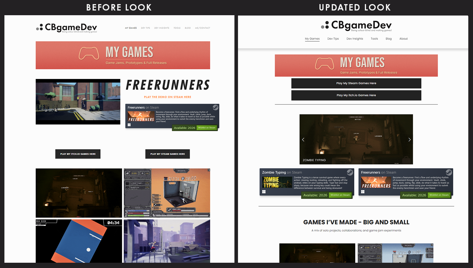
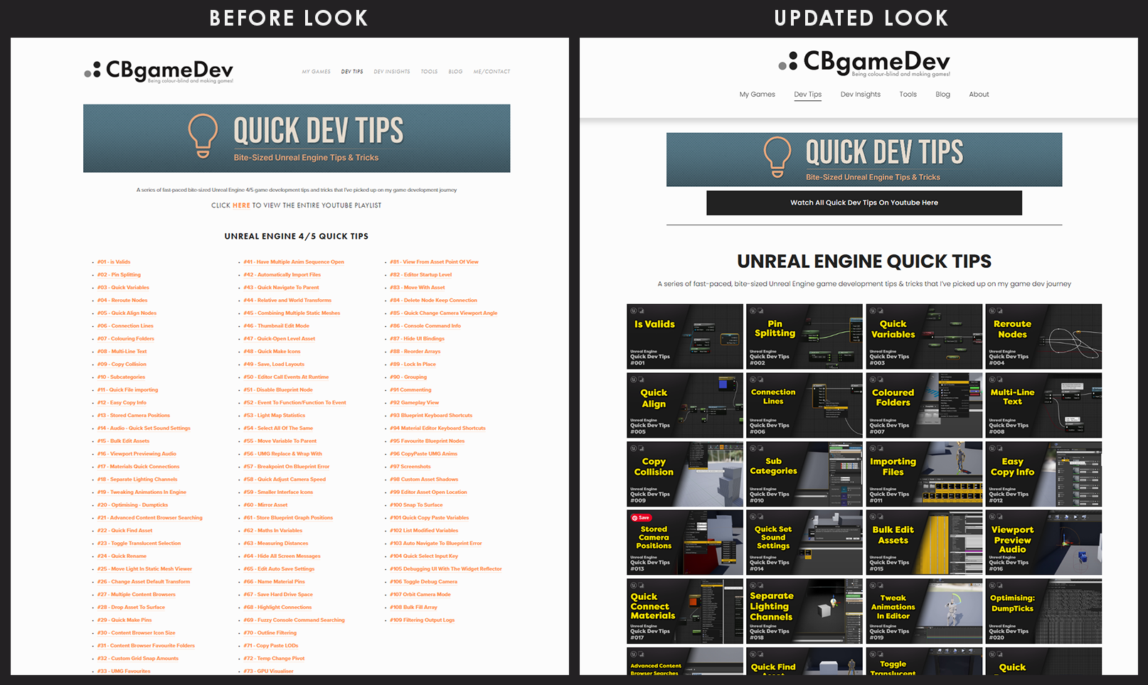
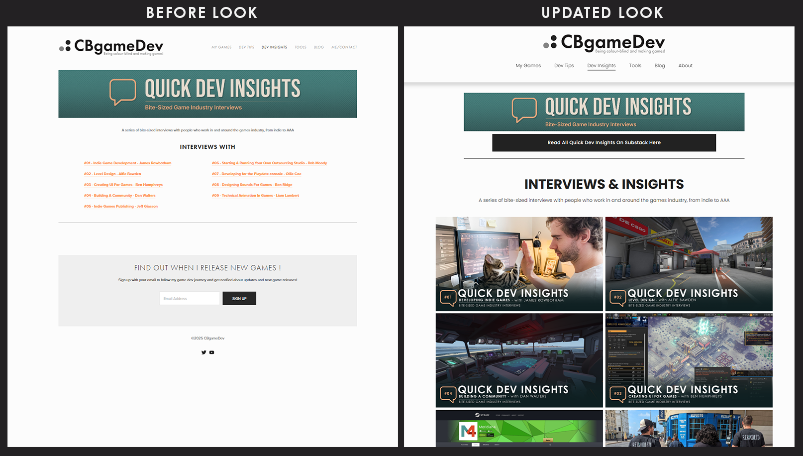
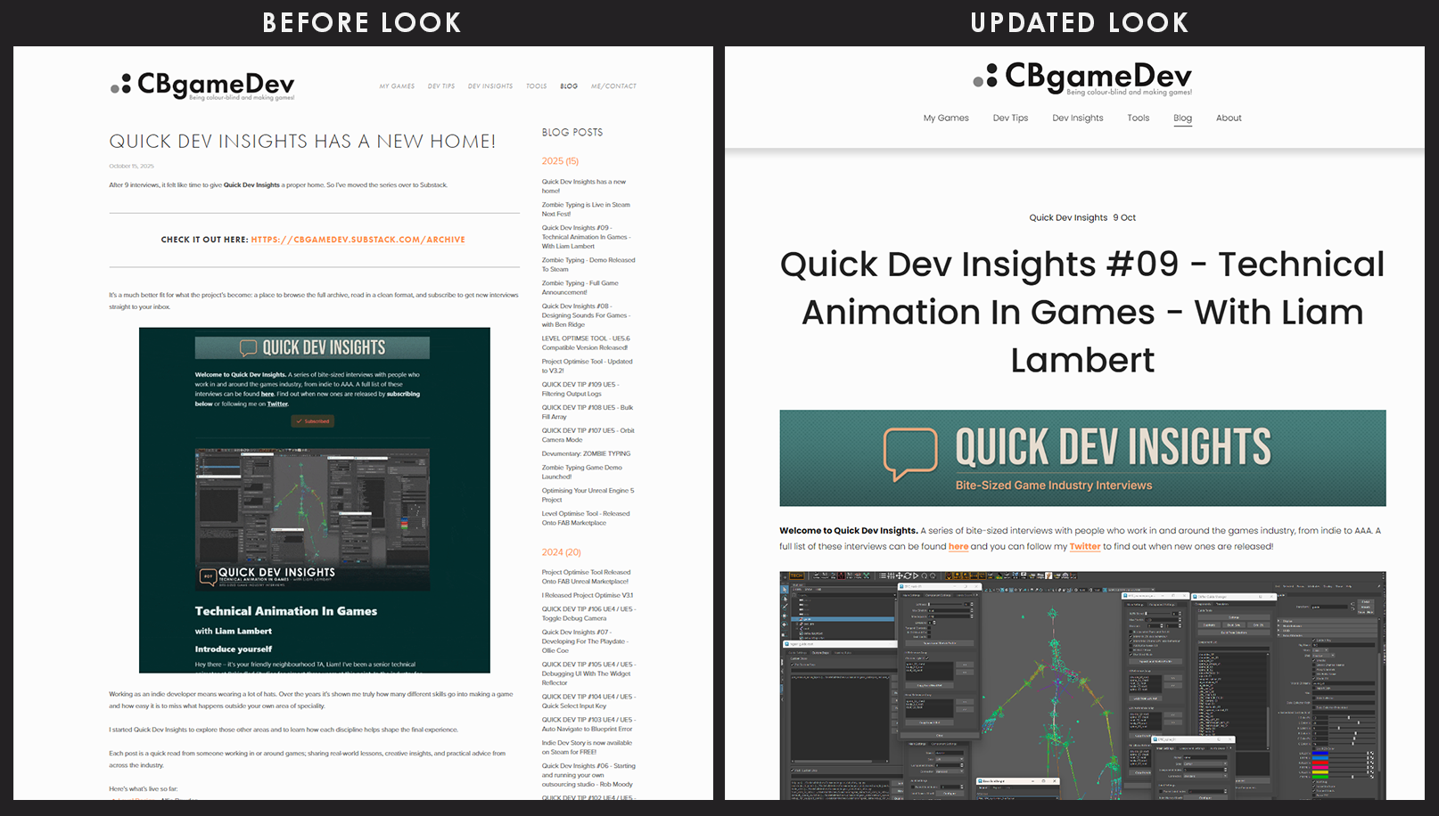
Below you can see some of the before-and-after comparisons, starting with My Games:
My Games
Quick Dev Tips
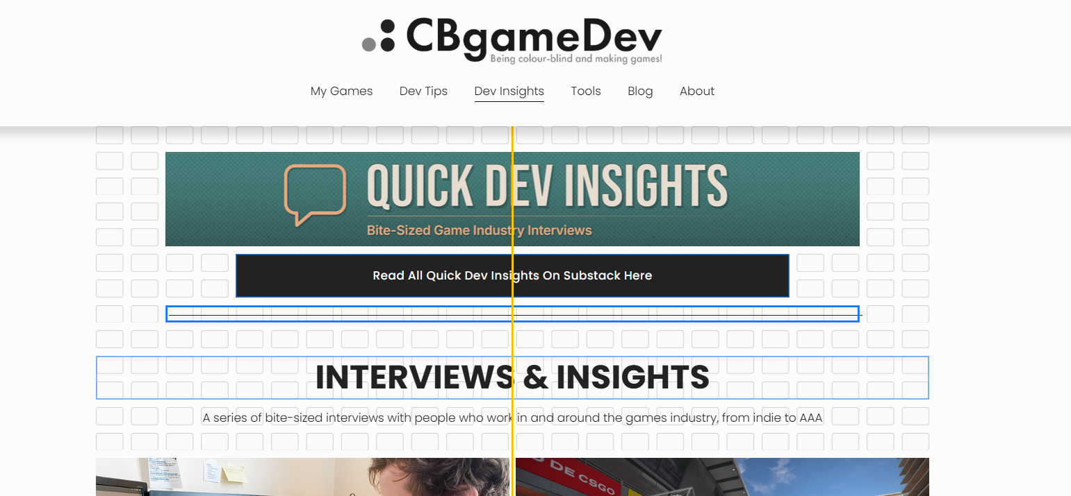
Quick Dev Insights
My Tools

My Blogs
About Me

Colourblind Problems/Failing
One big change I wanted to make was switching the website to a dark mode theme instead of the bright white it had before. I’m a big fan of dark mode in general, and I wanted the site to have a look closer to Notion’s dark mode.
However, being colourblind, I knew this was going to be painful and really struggled with this.
The first problem was that all the default Squarespace themes were bright, light, and cheerful. Exactly the opposite of what I wanted, as you can see below:

You can change colours in other areas of the website, but it quickly gets very granular and honestly, as someone who’s colourblind, it’s almost impossible to manage. There are just too many settings to tweak.
I spent a good couple of hours trying to adjust colours across different parts of the website backend.
Below is one of the many places where you can manually configure colours for different areas:
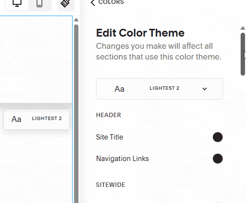
Maybe I’m missing something and there’s an easier way to do it, but I eventually gave up on getting that dark mode look. I’ll have a go again in the future, or maybe hire someone to help me get it done.
A Big Benefit of The Squarespace Update
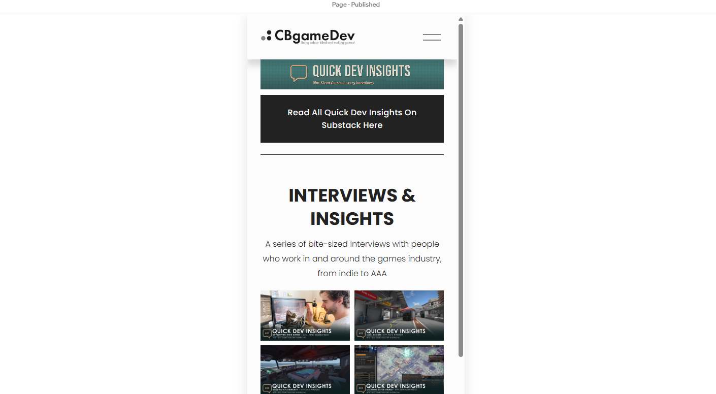
One really useful benefit of upgrading to 7.1 was being able to preview the website on mobile. You are also able to tweak layouts separately for mobile and desktop, which makes a huge difference.
I went through each page of my site, using the mobile viewer. A lot of things just didn’t feel right, and so I made a bunch of small layout fixes.
Honestly, this feature alone made the update worth it.
Below you can see the mobile view of my quick dev insights page:
Never Finished
One thing I realised from doing the branding stuff before was that branding and design is never truly finished, its always evolving.
While I am happy with the improvements that I made to my website. I am sure that I will come back and end up tweaking it again in the future.
And who knows, maybe one day I’ll finally figure out how to get that dark mode working and looking good!