
New Branding!
I was having a coffee the other day and started thinking about all the different things I work on in my personal time:
They’ve all grown a lot over the years, but as I looked at them together, I realised something… they felt disjointed and some of them had no real branding at all. It makes sense in hindsight. I started each of them at different points in my life and was just doing them for fun. Back then, branding wasn’t even on my radar. I was more focused on making stuff than on how it looked as a whole. But after doing over 100 Quick Dev Tips and building a real series out of it, it suddenly felt a lot more relevant.
This led me to think about how I can change that. I wanted each project to have its own individual branding, but also to feel like part of a bigger family. Having a consistent look and feel that ties everything together under the CB Game Dev umbrella.
Below you can see some of my original brandings:

I think the real catalyst for all of this came when I started moving my Quick Dev Insights series from my blog over to Substack. Substack just made more sense for what the series had grown into and where I wanted to take it: a place to browse the full archive, read in a clean format, and subscribe to get new interviews straight to your inbox.
While setting it up, something became immediately clear: my original logo wasn’t up to the standard I wanted anymore. I’d made it very quickly when I first started the series, and although it did the job at the time, it didn’t really reflect the standard of what I wanted the project to be now.
You can see the old Quick Dev Insights branding below:

Like I said, it did the job, but it was very plain. So I got to designing and making some new stuff. First off, I looked around a bunch for design ideas and also asked Chat GPT to generate some initial ideas, which you can see below:
The GPT stuff was interesting, but it wasn’t right. However, it did get my creative juices flowing. I sat down one Saturday and started playing, no strict plan, just exploring shapes, fonts, and layouts until something started to click.
Here was my first attempt:

I liked elements of this, but something still felt off. I’m colourblind, so colour is always a tricky part of the process for me. I could tell something wasn't working colour-wise, but couldn't put my finger on it. So I asked my wife what she thought (she does illustration). We sat down and started experimenting. Quickly picking and mocking up some more interesting colour combinations, trying to find something which would give the design more life.
You can see those early colour tests below:

After that I started incorporating these colours into the design more. It immediately started feeling better, brighter, more alive.
You can see the colour changes below:

Something still wasn’t quite clicking. I showed my wife again, and we talked it over; it was now more of a layout problem. She pointed out that I was designing for a vertical banner that didn’t really have a purpose or specific resolution in mind.
In hindsight, it seems obvious. I should have been designing for a format I would actually use. So I started working in banner form, building layouts I could actually use on my site and Substack, etc.
That shift made a huge difference. I focused first on my Quick Dev Tips series and worked through a bunch of iterations, slowly refining the composition, spacing, and overall feel until it started clicking.
You can see those iterations below (1 being where I started and 5 being the final design):

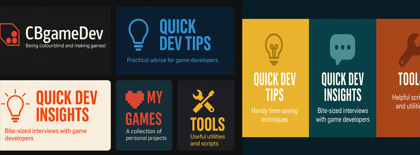
Once I was happy with how the Quick Dev Tips banner was looking, I took that same look and style and began applying it to the other topics.
I wanted each one to have its own identity and colour, but still clearly feel like part of the same family; unified through layout, font, and structure.
Below you can see how they came together:

I played around with a few designs, Centered, Left aligned. Keeping in mind potential uses (banners, headers etc). Which you can see below:
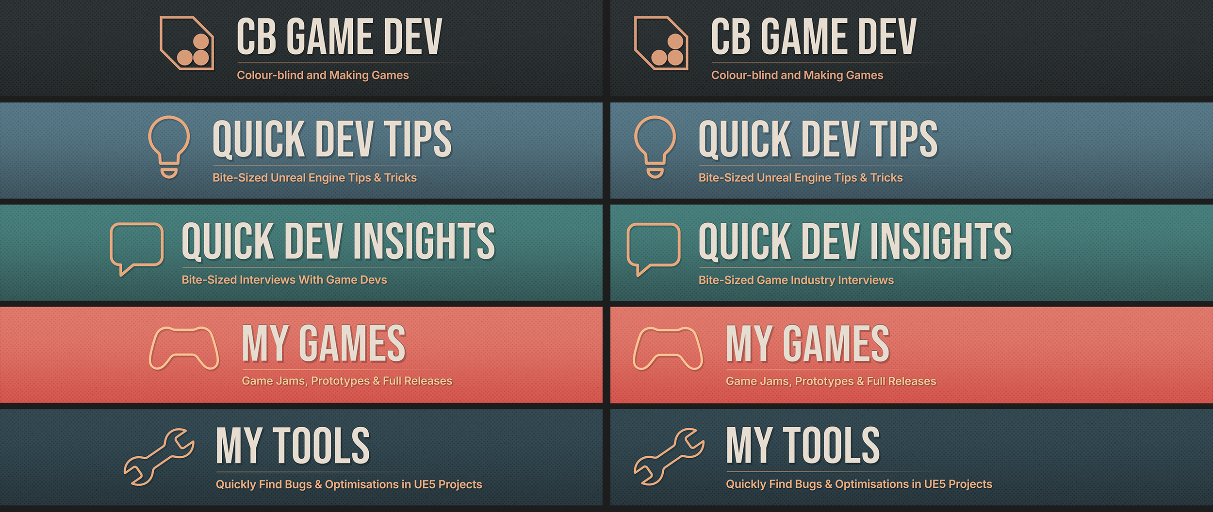
Then I figured I should probably make some icon-specific versions of the branding too, as I knew I’d likely need them at some point. They’d be useful for smaller spaces like social posts, thumbnails, or profile icons on things like Substack. Having a consistent set would help everything feel that bit more cohesive. Because I had already put in the design work, this was a pretty simple process; it was basically size and layout.
Below you can see the icons:

While it’s not perfect, and I’m sure I’ll keep tweaking things over time, I’m really happy with the outcome. It feels far more coherent now, with a sense of professionalism while (hopefully) still keeping that indie feel that runs through everything I do.
Most importantly, it finally connects everything: my games, tools, tips, and insights, under one consistent look and identity.
You can see a before and after of my branding below:

Funny thing is, even after doing all this work, I quickly realised that every platform wants something slightly different. Different resolutions, banner ratios, and file sizes.
So I still have to rework things for pretty much every site. But the difference now is that I’m not redesigning each time; I’m just adapting. Having a high-quality, high-res base PSD file and a clear design principle makes the process so much easier. It’s more about shifting things around rather than designing on the fly.
A good example of that was for Substack I needed a banner that was wider and less tall. So I just re-framed my existing design and adjusted the layout, rather than needing to start from scratch.
You can see the Substack adaptation below:

I guess I could’ve hired someone to do all this branding stuff for me, but honestly, I think you grow by doing the things you’re not already good at. And since this is all for my personal projects, it felt right to figure it out myself.
One thing I realised though, is branding’s never really done. It evolves as your work does. But this feels like a solid foundation for me to build off of. Everything now shares a clearer identity, a bit more personality, and feels connected in a way it didn’t before. It’s a small thing, but it makes a big difference in how I think about and present everything I create.
BLOG POSTS
-
2025
16
- Oct 26, 2025 New Branding!
- Oct 15, 2025 Quick Dev Insights has a new home!
- Oct 13, 2025 Zombie Typing is Live in Steam Next Fest!
- Oct 9, 2025 Quick Dev Insights #09 - Technical Animation In Games - With Liam Lambert
- Oct 4, 2025 Zombie Typing - Demo Released To Steam
- Sep 13, 2025 Zombie Typing - Full Game Announcement!
- Sep 10, 2025 Quick Dev Insights #08 - Designing Sounds For Games - with Ben Ridge
- Aug 13, 2025 LEVEL OPTIMSE TOOL - UE5.6 Compatible Version Released!
- Aug 9, 2025 Project Optimise Tool - Updated to V3.2!
- Aug 7, 2025 QUICK DEV TIP #109 UE5 - Filtering Output Logs
- Jul 23, 2025 QUICK DEV TIP #108 UE5 - Bulk Fill Array
- Jul 23, 2025 QUICK DEV TIP #107 UE5 - Orbit Camera Mode
- Jul 21, 2025 Devumentary: ZOMBIE TYPING
- Jul 15, 2025 Zombie Typing Game Demo Launched!
- Apr 25, 2025 Optimising Your Unreal Engine 5 Project
- Mar 29, 2025 Level Optimise Tool - Released Onto FAB Marketplace
-
2024
20
- Nov 24, 2024 Project Optimise Tool Released Onto FAB Unreal Marketplace!
- Oct 12, 2024 I Released Project Optimise V3.1
- Sep 17, 2024 QUICK DEV TIP #106 UE4 / UE5 - Toggle Debug Camera
- Sep 7, 2024 Quick Dev Insights #07 - Developing For The Playdate - Ollie Coe
- Sep 3, 2024 QUICK DEV TIP #105 UE4 / UE5 - Debugging UI With The Widget Reflector
- Sep 3, 2024 QUICK DEV TIP #104 UE4 / UE5 - Quick Select Input Key
- Sep 2, 2024 QUICK DEV TIP #103 UE4 / UE5 - Auto Navigate to Blueprint Error
- Aug 28, 2024 Indie Dev Story is now available on Steam for FREE!
- Aug 20, 2024 Quick Dev Insights #06 - Starting and running your own outsourcing studio - Rob Moody
- Aug 4, 2024 QUICK DEV TIP #102 UE4 / UE5 - List Modified Variables
- Aug 4, 2024 QUICK DEV TIP #101 UE5 - Quick Copy Paste Variables
- Jul 31, 2024 Indie Dev Story Patch Notes for V1.3
- Apr 22, 2024 Testing out Tech: Adobe Express - Animations from Audio
- Apr 20, 2024 Made a new Game: Ultra Ball!
- Mar 5, 2024 FREERUNNERS PROGRESS - More ways to Fail
- Feb 27, 2024 Freerunners Progress - A better flow
- Feb 21, 2024 Freerunners Marketing, Lets get started!
- Feb 17, 2024 FREERUNNERS Steam Next Fest Postmortem
- Feb 7, 2024 FREERUNNERS IS IN STEAM NEXT FEST FEB 2024!
- Jan 25, 2024 FREERUNNERS DEMO UPDATE! (JANUARY 2024)
-
2023
18
- Dec 31, 2023 Marauders Community Memes, Art and Cosplay! Dec 2023 Edition
- Nov 27, 2023 Freerunners Demo Updates! (November 2023)
- Oct 7, 2023 Project Optimise Tool (Unreal Engine) : How To Use
- Oct 7, 2023 Project Optimise Tool Is Now Downloadable From My itch.io Page
- Sep 8, 2023 Freerunners Demo Out Now!
- Sep 4, 2023 All Things Marauders (March - August 2023)
- Aug 8, 2023 10 Tips for Faster Blueprint Using
- Aug 5, 2023 Updated my Free Unreal Engine Tool: Project Optimise
- Jun 10, 2023 Meetup at the Team17 office!
- Apr 28, 2023 New Unreal Engine Tool: Project Optimise!
- Apr 14, 2023 21 UE4/UE5 Tips To Help You Build Out Levels Faster
- Mar 31, 2023 I did a talk at GDC!
- Mar 4, 2023 4 Material Editor Tips for Unreal Engine
- Feb 25, 2023 6 Tips for Faster Blueprinting!
- Feb 13, 2023 5 Useful Unreal Engine Blueprint Tips/Tricks
- Feb 9, 2023 3 Quick Unreal Engine Sound Tips/Tricks
- Jan 20, 2023 Compare Data tables Tool for Unreal Engine
- Jan 3, 2023 I Tried Rokoko Video - Free Ai Motion Capture
-
2022
55
- Dec 29, 2022 3 Quick Unreal Engine Animation Tips/Tricks
- Dec 21, 2022 Marauders: The Red Baron Update
- Dec 6, 2022 50 Quick Tips and Tricks for Unreal Engine. How many do you know?
- Dec 5, 2022 F1 Marauders Art
- Nov 21, 2022 QUICK DEV TIP #100 UE4 / UE5 - Snap To Surface
- Nov 15, 2022 Quick Dev Insights #02 - Level Designer - Alfie Bawden
- Nov 12, 2022 QUICK DEV TIP #99 UE4 / UE5 - Editor Asset Open Location
- Nov 11, 2022 Launching Marauders into EA
- Nov 11, 2022 Marauders Memes#1
- Nov 7, 2022 QUICK DEV TIP #98 UE4 / UE5 - Custom Asset Shadow
- Oct 29, 2022 QUICK DEV TIP #97 UE4 / UE5 - Screenshots
- Oct 24, 2022 QUICK DEV TIP #96 UE4 / UE5 - Copy Paste UMG Anims
- Oct 16, 2022 QUICK DEV TIP #95 UE4 / UE5 - Favourite Blueprint Nodes
- Oct 12, 2022 Rust bucket 3D Print
- Oct 12, 2022 QUICK DEV TIP #94 UE4 / UE5 - MATERIAL EDITOR KEYBOARD SHORTCUTS
- Sep 27, 2022 QUICK DEV TIP #93 UE4 / UE5 - Blueprint Keyboard Shortcuts
- Sep 19, 2022 QUICK DEV TIP #92 UE4 / UE5 - GAMEPLAY VIEW
- Sep 10, 2022 Marauders Progress
- Sep 3, 2022 QUICK DEV TIP #91 UE4 / UE5 - COMMENTING
- Aug 22, 2022 QUICK DEV TIP #90 UE4 / UE5 - GROUPING
- Aug 15, 2022 QUICK DEV TIP #89 UE4 / UE5 - LOCK IN PLACE
- Aug 5, 2022 QUICK DEV TIP #88 UE4 / UE5 - REORDER ARRAY
- Jul 19, 2022 QUICK DEV TIP #87 UE4 / UE5 - HIDE UI BINDINGS
- Jul 12, 2022 QUICK DEV TIP #86 UE4 / UE5 - CONSOLE COMMAND INFO
- Jul 3, 2022 QUICK DEV TIP #85 UE4 / UE5 - QUICK CHANGE VIEWPORT ANGLE
- Jun 27, 2022 QUICK DEV TIP #84 UE4 / UE5 - DELETE NODE, KEEP CONNECTION
- Jun 19, 2022 QUICK DEV TIP #83 UE4 / UE5 - MOVE WITH ASSET
- Jun 12, 2022 QUICK DEV TIP #82 UE4 / UE5 - EDITOR START UP LEVEL
- Jun 6, 2022 QUICK DEV TIP #81 UE4 / UE5 - VIEW FROM ASSET POINT OF VIEW
- May 29, 2022 QUICK DEV TIP #80 UE4 / UE5 - EXTRA INFO ABOUT NODES
- May 29, 2022 Quick Dev Insights #05 - Indie Games Publisher - Jeff Giasson
- May 23, 2022 QUICK DEV TIP #79 UE4 / UE5 - CONTENT BROWSER FILTERS
- May 16, 2022 QUICK DEV TIP #78 UE4 / UE5 - ADJUST GIZMO SIZE
- May 10, 2022 QUICK DEV TIP #77 UE4 / UE5 - FULL SCREEN VIEWPORT
- May 3, 2022 QUICK DEV TIP #76 UE4 / UE5 - SPEED TREE COLOUR VARIATION NODE
- Apr 28, 2022 Quick Dev Insights #04 - Building A Community - Dan Walters
- Apr 26, 2022 QUICK DEV TIP #74 UE4 / UE5 - OPTIMISING TICK RATE
- Apr 25, 2022 QUICK DEV TIP #75 UE4 / UE5 - MAP THUMBNAIL ICONS
- Apr 12, 2022 QUICK DEV TIP #73 UE4 / UE5 - GPU VISUALISER
- Apr 9, 2022 Quick Dev Insights #03 - Creating UI For Games - Ben Humphreys
- Apr 5, 2022 QUICK DEV TIP #72 UE4 / UE5 - TEMP CHANGE PIVOT
- Mar 28, 2022 QUICK DEV TIP #71 UE4 / UE5 - COPY PASTE LODs
- Mar 24, 2022 Marauders Has Been Announced!
- Mar 22, 2022 QUICK DEV TIP #70 UE4 / UE5 - OUTLINER FILTERING
- Mar 15, 2022 QUICK DEV TIP #69 UE4 / UE5 - CONSOLE COMMAND SEARCHING
- Mar 7, 2022 QUICK DEV TIP #68 UE4 / UE5 - HIGHLIGHTING CONNECTIONS
- Mar 1, 2022 QUICK DEV TIP #67 UE4 / UE5 - SAVE HARD DRIVE SPACE
- Feb 21, 2022 QUICK DEV TIP #66 UE4 / UE5 - NAME MATERIAL PINS
- Feb 15, 2022 QUICK DEV TIP #65 UE4 / UE5 - EDIT AUTOSAVE SETTINGS
- Feb 6, 2022 QUICK DEV TIP #64 UE4 / UE5 - HIDE ALL SCREEN MESSAGES
- Jan 31, 2022 QUICK DEV TIP #63 UE4 / UE5 - MEASURING DISTANCES
- Jan 25, 2022 QUICK DEV TIP #62 UE4 / UE5 - MATHS IN VARIABLES
- Jan 17, 2022 QUICK DEV TIP #61 UE4 / UE5 - STORE BLUEPRINT GRAPH POSITIONS
- Jan 11, 2022 QUICK DEV TIP #60 UE4 / UE5 - MIRROR ASSETS
- Jan 3, 2022 QUICK DEV TIP #59 UE4 / UE5 - SMALLER INTERFACE ICONS
-
2021
55
- Dec 27, 2021 QUICK DEV TIP #58 UE4 / UE5 - QUICK ADJUST CAMERA SPEED
- Dec 20, 2021 QUICK DEV TIP #57 UE4 / UE5 - BREAKPOINT ON BLUEPRINT ERROR
- Dec 13, 2021 QUICK DEV TIP #56 UE4 / UE5 - UMG REPLACE & WRAP WITH
- Dec 6, 2021 QUICK DEV TIP #55 UE4 / UE5 - MOVE VARIABLE TO PARENT
- Nov 29, 2021 QUICK DEV TIP #54 UE4 / UE5 - SELECT ALL OF THE SAME
- Nov 22, 2021 QUICK DEV TIP #53 UE4 / UE5 - LIGHT MAP STATISTICS
- Nov 16, 2021 QUICK DEV TIP #52 UE4 / UE5 - EVENT TO FUNCTION / FUNCTION TO EVENT
- Nov 8, 2021 QUICK DEV TIP #51 UE4 / UE5 - DISABLE BLUEPRINT NODE
- Nov 1, 2021 QUICK DEV TIP #50 UE4 / UE5 - EDITOR CALL EVENTS AT RUNTIME
- Oct 25, 2021 QUICK DEV TIP #49 UE4 / UE5 - SAVE LOAD LAYOUTS
- Oct 18, 2021 QUICK DEV TIP #48 UE4 / UE5 - QUICK MAKE ICONS
- Oct 18, 2021 My steam page got approved for my game Freerunners!
- Oct 11, 2021 QUICK DEV TIP #47 UE4 / UE5 - QUICK OPEN LEVEL ASSET
- Oct 4, 2021 QUICK DEV TIP #46 UE4 / UE5 - THUMBNAIL EDIT MODE
- Sep 27, 2021 QUICK DEV TIP #45 UE4 / UE5 - COMBINING MULTIPLE STATIC MESHES
- Sep 20, 2021 QUICK DEV TIP #44 UE4 / UE5 - RELATIVE AND WORLD TRANSFORMS
- Sep 13, 2021 QUICK DEV TIP #43 UE4 / UE5 - QUICK NAVIGATE TO BLUEPRINT PARENT
- Sep 6, 2021 QUICK DEV TIP #42 UE4 / UE5 - Automatically Reimport Files
- Aug 30, 2021 QUICK DEV TIP #41 UE4 / UE5 - Have Multiple Anim Sequences Open
- Aug 24, 2021 QUICK DEV TIP #40 UE4 / UE5 - Diffing Blueprints
- Aug 16, 2021 QUICK DEV TIP #39 UE4 / UE5 - Quick Tweak Textures
- Aug 9, 2021 QUICK DEV TIP #38 UE4 / UE5 - Animation Pose Into Static Mesh
- Aug 2, 2021 We Won An Award!
- Aug 2, 2021 QUICK DEV TIP #37 UE4 / UE5 - Colourblind Editor Mode
- Jul 26, 2021 QUICK DEV TIP #36 UE4 / UE5 - Saving Colours
- Jul 19, 2021 QUICK DEV TIP #35 UE4 / UE5 - Quick Switch Tabs
- Jul 12, 2021 QUICK DEV TIP #34 UE4 / UE5 - Find Across Whole Project
- Jul 5, 2021 QUICK DEV TIP #33 UE4 / UE5 - UMG Favourites
- Jun 28, 2021 QUICK DEV TIP #32 UE4 - Custom Grid Snap Amounts
- Jun 21, 2021 QUICK DEV TIP #31 UE4 - Favourite Folders
- Jun 13, 2021 QUICK DEV TIP #30 UE4 - Content Browser Icon Size
- Jun 7, 2021 QUICK DEV TIP #29 UE4 - Quick Make Pins
- May 31, 2021 QUICK DEV TIP #28 UE4 - Drop Asset To Surface
- May 24, 2021 QUICK DEV TIP #27 UE4 - Multiple Content Browsers
- May 17, 2021 QUICK DEV TIP #26 UE4 - Change Asset Default Transform
- May 10, 2021 QUICK DEV TIP #25 UE4 - Move Light In Static Mesh Viewer
- May 3, 2021 QUICK DEV TIP #24 UE4 - Quick Rename
- May 3, 2021 Survive Another Night Patch Notes
- Apr 26, 2021 QUICK DEV TIP #23 UE4 - Toggle Translucent Selection
- Apr 19, 2021 QUICK DEV TIP #22 UE4 - Quick Find Asset
- Apr 12, 2021 QUICK DEV TIP #21 UE4 - ADVANCED CONTENT BROWSER SEARCHING
- Apr 5, 2021 QUICK DEV TIP #20 UE4 - OPTIMISING: DUMPTICKS
- Mar 29, 2021 QUICK DEV TIP #19 UE4 - TWEAK ANIMATIONS IN EDITOR
- Mar 22, 2021 QUICK DEV TIP #18 UE4 - SEPARATE LIGHTING CHANNELS
- Mar 15, 2021 QUICK DEV TIP #17 UE4 - MATERIALS QUICK CONNECT
- Mar 8, 2021 QUICK DEV TIP #16 UE4 - PREVIEW AUDIO FROM VIEWPORT
- Mar 1, 2021 QUICK DEV TIP #15 UE4 - BULK EDIT ASSETS
- Feb 22, 2021 QUICK DEV TIP #14 UE4 - QUICK SET SOUND SETTINGS
- Feb 15, 2021 QUICK DEV TIP #13 UE4 - STORED CAMERA POSITIONS
- Feb 8, 2021 QUICK DEV TIP #12 UE4 - BLUEPRINTS - EASY COPY INFO
- Feb 1, 2021 QUICK DEV TIP #11 UE4 - BLUEPRINTS - QUICK IMPORTING FILES
- Jan 25, 2021 QUICK DEV TIP #10 UE4 - BLUEPRINTS - SUBCATEGORIES
- Jan 18, 2021 QUICK DEV TIP #09 UE4 - BLUEPRINTS - COPY COLLISION
- Jan 12, 2021 QUICK DEV TIP #08 UE4 - MULTI-LINE TEXT!
- Jan 5, 2021 Quick Dev Tip #07 UE4 - Coloured Folders!
-
2020
11
- Dec 28, 2020 Quick Dev Tip #06 UE4 - Connection Lines
- Dec 28, 2020 Survive Another Night Postmortem
- Dec 21, 2020 Quick Dev Tip #05 UE4 - Quick Align Nodes
- Dec 16, 2020 Quick Dev Tip #4 UE4 - Reroute Nodes
- Dec 13, 2020 Quick Dev Tip #3 UE4 - Blueprints Quick Variables
- Dec 13, 2020 My 2020 Epic MegaJam Entry
- Nov 30, 2020 Quick Dev Tip #2 UE4 - Blueprints - Pin Splitting
- Nov 24, 2020 New Quick Dev Tips Series
- May 7, 2020 "Marauder" Our New Game
- Apr 12, 2020 Bringing Images To Life
- Apr 11, 2020 VR Fun
-
2019
1
- May 26, 2019 Art'ing
-
2018
2
- Sep 3, 2018 Playing around making a loading icon
- Aug 12, 2018 Showreel of my animations from "The Black Death"
-
2017
8
- Nov 4, 2017 RAGE trailer
- Nov 4, 2017 Made a Trailer for 'Indie Dev Story'
- Oct 25, 2017 Indie Dev Story Patch Notes V1.1 & V1.2
- Sep 22, 2017 The Black Death has been shortlisted for an Award!
- Aug 5, 2017 Rage Postmortem
- Aug 5, 2017 Finished my next game! "Rage"
- Jun 29, 2017 Busy, Busy and The Black Death Progress
- Feb 19, 2017 Gifs of the little games I have made so far!
-
2016
14
- Dec 10, 2016 Indie Dev Story Postmortem
- Dec 4, 2016 Finished 'Indie Dev Story'
- Dec 2, 2016 CBgameDev Logo
- Nov 12, 2016 TBD Hit 80% Woop! & Nottingham Gamecity Festival Talk!
- Oct 8, 2016 The Black Death at EGX 2016!
- Aug 23, 2016 The Black Death at Gamescom, Germany 2016
- Jun 9, 2016 Finished my next mini game
- May 27, 2016 More pixel playing around
- May 18, 2016 The Black Death at Rezzed
- Apr 2, 2016 Boxes animating
- Apr 2, 2016 Recording Lets Play For the Black Death
- Mar 27, 2016 Playing around with pixel art
- Mar 17, 2016 Made a Launcher for my game Jam Games
- Mar 17, 2016 My First Pixel Animation